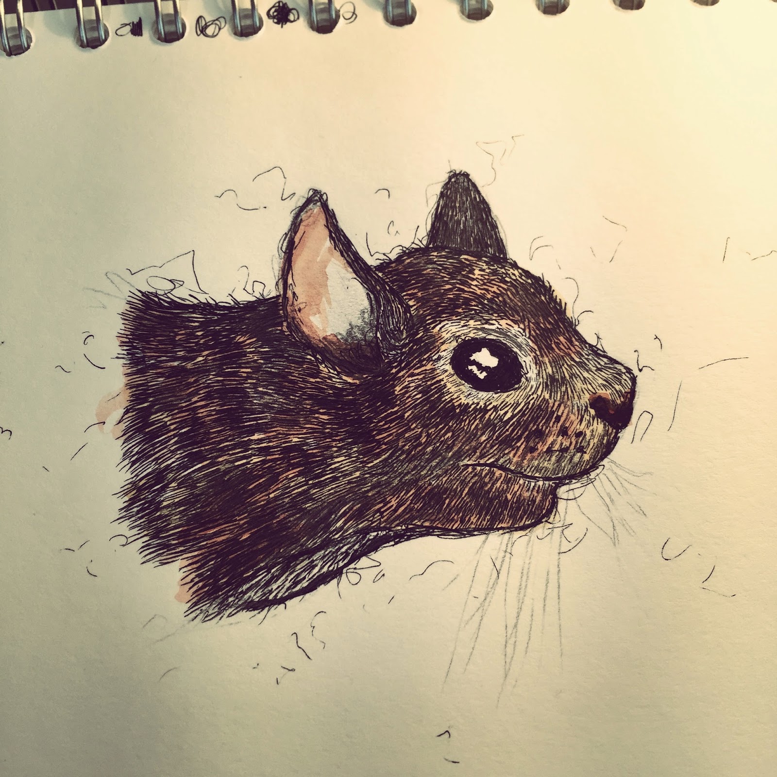
For page #9, I decided to feature the Badger.
I felt that I could comfortably fit up to two Badger designs on the single page, and I was very happy with two of the illustrations that I created, as I felt that they fit, and worked perfectly together.
I intentionally illustrated a left, and right version of the animal, because I had a really good idea of how to display them.
I had the idea of having them both facing away from each other, and this would allow for the viewer to get a good sense of what the animal looks like, and how they look from differing animals.
As you can see in the screenshot below, I did just that, and I feel that it really works for the design of the page.
Once I arranged the images, I enhanced the black point of the CYMK slightly, in order to compensate for the photocopier's laser washing the tone out of the image.
Once I was happy with the arrangement of the illustrations, and how the design looked so far, I thought about what wording I could possibly use to work with the design of the page.
I turned my attention to looking at the folklore of the badger.
I looked at a few websites that went into some level of detail about the folklore behind the Badger, and I came across the following short poem below, which discusses the Badger's mythical association with bad luck.
"Should one hear a badger call,
And then an ullot cry,
Make thy peace with God, good soul,
For thou shall shortly die."
 |
| http://www.badgerland.co.uk/education/stories/folklore.html < image reference at this link. |
Since I filled most of the page with the illustrations, I thought about where the text could possibly go, and with the illustrations taking up the majority of the page, I thought about perhaps weaving in the text with the illustrations.
Since I found that Badgers have an association with bad luck, I wanted my text to be on this subject,
Like all the other pages, my text was written using watercolour paints, and I continued this with page #13.
I thought about how I could layer the text onto the page, and I had the idea of making the page almost appear 3d, and to have an element of depth.
This effect I thought could make the page more interesting, so I split the file into layers, and applied some text behind, and some in front of the two illustrations.
I really liked how some of the lettering has been hidden by the illustrations, however is still legible, and understandable.
With the text now included as part of the design, I felt that page #13 was finally complete, and I am very happy with the outcome of this page.
http://www.badgerland.co.uk/education/stories/folklore.html
Thomas.


)


