Thursday, 30 April 2015

Page #18 (Blue Tit)

For the 18th page in the zine, I decided to dedicate this page to be covered by the small blue tit, which is a common sight in many British gardens.
The blue tit is a very colourful bird, with splashes of yellow, green and blue making up its feathers making it a very desirable animal to feature in my zine.

http://upload.wikimedia.org/wikipedia/commons/d/d6/Blue_Tit_on_a_washing_line_-_geograph.org.uk_-_1714041.jpg < image reference at this link.
I thought about using this particular bird after producing research on the creature earlier, and I worked on three illustrations of the animal while I was researching it.


I was initially happier with the latter illustrations, and I imported it into photoshop, and tweaked the eye on the third image, as it looked unnaturally centred on the head.

The image in photoshop, with the tweaked eye.
I enhanced the colour in order to make the image more vivid, and stand out. Enhancing the colour also compensated for the scanner washing some of the tone out.
At this point, I wasn't happy with the way in which the bird was presented, as even though I attempted to correct the eye, other parts of the visual anatomy appeared wrong.

At this point, I though about using the first two illustrations featured above, in a tandem design.


I imported them into photoshop, and positioned in a way that would allow each image to compliment each other.
Once the images were applied, I tweaked the colour tones of the top, and bottom illustration, in order to make them stand out against the background better.


At this point, I was happy with the design of the page so far, and so I looked toward providing a connection between the illustration and the folklore behind the animal.
I began my research into this part by running a quick search for Blue Tit folklore.

 image reference at this link. > www.google.com
I was very surprised to see that there actually wasn't much interesting folklore surrounding the blue tit, and I was very disappointed with this void.
Due to the lack of interesting folklore in my opinion, I decided to focus on the traits of the Blue Tit, in a similar way to how I decided to do this with other animals.

When I see/think of the Blue Tit, I think of the following points.
  • Small
  • Colourful/bright
  • Smart
  • Loves to sing
  • They kind of look like a small, less colourful parrot in my opinion.
  • They are quite common.
  • They thrive in many different environments/settings.
I decided to focus on the point of the Blue tit being almost Parrot like in terms of colour, and the bird is sometimes referred to as the English Parrot.

I coined the below term, because the Blue Tit lives in all areas of the UK, including urban areas such as towns and cities for example, not just the countryside.
The term Parrot reflects upon the Blue Tit's bright, and vivid colours, making it almost Parrot like in terms of appearance.

After I hand painted the typography, I positioned it on the page in a way that would compliment the illustrations, and also allow for legibility.


After this I enhanced the blue tone to compensate for the washing out effect that the laser scanner gives images.
With the typography applied, I felt that the 18th page of the zine was now completed.


Thomas.

Tuesday, 28 April 2015

Postcards

Postcards are a simple, cheap, and easy way for an illustrator to make some money, and I have seen quite a few illustrators pursue the selling of these items as merchandise.
Postcards are usually bought either to collect as a piece of art, or of course for use as a postcard.

http://static9.moo.com/images/ideas/inspiration/sell-your-illustration-1-slideshow.jpg?q=1-21571128041416488033 < image reference at this link.
Postcards are generally small pieces of card, with one side containing an illustration/design, and the other containing information, and a postcard layout, with an example below.

http://www.removables.co.uk/12_postcards_album/images/02_postcard.gif < image reference at his link.
When I went to Berlin, I met two illustrators in the city, and one of them was Jakob Hinrichs.
Jakob is an illustrator who works a lot in the field of book illustration, and editorial/advertising illustration. His client base spans a multinational level, and he deals a lot of his work with German, English, and American clients.
http://illustration.jakobhinrichs.com < image reference at this link.
https://s-media-cache-ak0.pinimg.com/originals/47/2a/c5/472ac5474a60965232f43bea0962dc9a.jpg < image reference at his link.

A postcard by Jakob Hinrichs.
Postcards are really easy to produce, and they can bring in a reasonable amount of income for an illustrator.
One can churn out postcards really quickly, and almost any design can be suited to the dimensions of the card.
This area of merchandise is a great area and I want to explore my options.


Thomas.

Monday, 27 April 2015

Business Cards

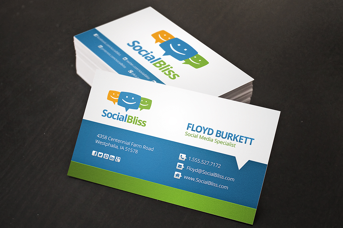
Business cards are a common thing used by illustrators, and other people who provide a service.
The business card acts as a platform for consumers to contact, and deal with business.
Business cards are small cards, containing information that a client uses to establish communications with, in this case an illustrator, however they span a large range of jobs and services.

https://d3ui957tjb5bqd.cloudfront.net/images/screenshots/products/2/22/22294/social-business-card-o.jpg?1371176953 < image reference at this link.
A business card usually consists of a few essential components, which contain most importantly the following.
  • Name
  • Email Adress
  • Phone Number
  • Sometimes the address of the business/studio if one has one available.
  • Brief explanation of their area of expertise.
  • Company name if one has been applied.

It would be very helpful to my practise to create some business cards, primarily in preparation for the selling of items at the London market.
I have been thinking of a few different ways in which I can make my own business cards, ranging from self assembled, to professionally produced.

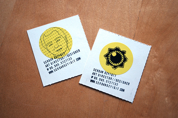
https://m1.behance.net/rendition/modules/5223861/disp/921503de25430604fd36f60a49aaa744.jpg < image reference at this link.
Each route has its own amount of advantages and disadvantages, and I will display the pros and cons of each route below.

Self-Assembled:

Pros:
  • Cheap to produce
  • Full design/creative freedom
  • Wider range of materials.
Cons:
  • Might look a bit unprofessional if cards are poorly made.
  • Will take a while to create, compared to professional assembly.
  • Need to find a method of printing myself.

Professionally Produced:

Pros:
  • Easy process
  • Looks great
  • Professionally printed
Cons:
  • Cost needs to be considered.
  • Takes time for delivery, and it might cost extra for this.
I think looking at the pros and cons of each route, I have a feeling that going down the route of having business cards made by a company may be the best for my practise.

http://www.vistaprint.co.uk/studio.aspx?pf_id=B71&page=1&alt_doc_id=NPCXL-B3A68-8K7&rd=1 < image reference at this link.
I used a service called vista print to produce 250 business cards, which cost £4.99. I thought this was a great price.


Thomas.

Prints

Not long ago, I published a blog post discussing merchandise to sell at the London Stall, and there are a few different items that I can assemble for May.
This blog post will be going over the topic of making art prints to sell, which is a great, and easy way for any illustrator to make some money.

I previously looked at Caitlin hacked, who produces a lot of official merchandise, including prints. She is by far not the only artist who does this, with many artists such as Drew Milward, Dan Mumford, and Luke Pearson just being a few notables.

http://blog.houseofbetty.com/wp-content/uploads/DrewMillwardGriffun.jpg < image reference at this link.
I have experimented with making prints of my work before, in fact only a few weeks ago I produced a few screen prints based on a few select pieces of my art, and placed them for sale on my Etsy shop.


So far however I have not yet sold any of my prints, however I am optimistic that I can make some more enticing prints to take with me to London.
There are a few illustrations of mine that I have created during the production of the zine that I have expressed interest in printing.


There are many different ways in which I can print any illustration I have created, and this involves screenprinting, which I experimented with earlier on in the module, risographing, and digital printing, the latter two I need to speak to Jade and the IT department about.

Whichever route I want to go down with in terms of printing method, I want to balance speed, cost, easiness and quality equally.
I will go over the pros and cons of each printing method below, in order to get a good idea of which route may be better.

Screenprinting

Pros:
  • Good colour
  • Crisp
  • Cheap
Cons:
  • One colour at a time
  • Slow preparation time.
  • Not good for fine levels of detail.

Riso-graphing

Pros:
  • Good colour
  • Cheap
  • Quick

Cons:
  • Takes a while to dry
  • Work can smudge

Digital Printing

Pros:
  • Good colour range
  • Quick
  • Easy
  • High Quality
Cons:
  • Consistency of ink can vary
  • Can be expensive

I think due to the cost, simplicity, and quality balance, I think that the route of digital printing will be the best method to go with, and I can achieve a high quality reproduction.
I will speak to Jade, and see what she thinks on the matter since she is more of a printing expert than me.

If I am selling prints, I would love to have some accompanied by a frame, and I recently went to IKEA, and picked up really cheap Ribba frames for £1.25 each.


If I sell each frame for £4.99, I can easily make a profit, as it cost very little to print.


Thomas.

Friday, 24 April 2015

Merch for London

As well as the zine, I want to sell a few different items alongside this, and this could not only be a good way to gain some needed exposure, but also a good way to make a little bit of money.
Some of the items I could make include the following.
  • Cards
  • Business Cards
  • Postcards
  • Posters 
  • Prints
  • Original pieces
  • T-Shirts & other apparel
This is a decent list of things I could potentially do, and I am very interested in the ones highlighted in yellow.

I have been looking at ways in which to create items to sell, that balance quality and cost production, which is an important aspect to take into account when selling items you have created.
For items like postcards, it could pay to look at vista print, which currently charge around £2 for 10 postcards. Selling each card at £1.50 would make a profit of £13 for example, and most of the production is on their part.

http://www.vistaprint.co.uk/postcards.aspx?txi=14949&xnid=Postcards&xnav=TopNav#design-options < image reference at this link.
A lot of artists sell merchandise in order to make some quick money, one particular artist who does this that I would wish to highlight, is Caitlin Hackett.

http://society6.com/caitlinhackettart < image reference at this link.
Caitlin Hackett has an account with a service that sells artist merchandise, and some of her items available for sale include prints, phone cases, cards, and tote bags etc.
She has a large following on the site, and she makes a reasonable amount of income from selling merchandise.

Most illustrators need as many different things as possible to sell, in order to bring in a good level of income, so it might pay to get some practise with producing merchandise whilst I am still in academic education.
I will post separate blogs about each route of merchandise I will take, as I think more about what I want to produce, and which items might have the best chance of financial gain.


Thomas.

Thursday, 23 April 2015

Page #15 (European Perch)

For page 15, I originally wanted to give to the rat, as part of a double page spread for pages 14 and 15. However, I decided to include more marine animals, and so I wanted to cut the double page spread short, and designate the rat to just one page, whilst allowing for a more diverse range of animals.

Due to my success with page 12 and 13, I wanted to include another fish since I had a lot of fun illustrating this particular species, and so after looking up British native fish, I ended up taking an interest in the Perch.

https://coloradooutdoorsmag.files.wordpress.com/2011/11/ice_perch001.jpg < image reference at this link.
To start off the assembly of the page, I created a new a5 canvas in photoshop, and took a look at an illustration that I was happy with.

The new canvas ready to be the base for the 15th page.

The illustration above, took about 2 hours to fully complete, and I was really proud of how I created it.
Since the Perch only needed one page to be featured, I thought that one illustration would be enough.

I first scanned the illustration into Adobe Photoshop, and place it central to the image.
After placement, I tweaked the colour to give it a golden tone, which allowed it to appear aged.
I added the Latin name of the species, to make it look like a scientific illustration.
I thought that the design looked really good without the need of adding any wording, such as folklore of the highlighting of traits, so I decided to leave the page as is.


Thomas.

Time issues & project alteration

From the moment I came up with the idea for my project, I knew that it would be a massive task, and would be a job that would take weeks, and even months of work. Since I wanted my zine to be of a very high quality, I wanted to create illustrations that I would be proud of.

As well as this, I wanted my zine to have a decent number of pages, and I think that I may have perhaps underestimated the amount of work, and the time required to fully complete a zine, to the standards that wanted.


When I was assembling my learning agreement, I produced a time table which acted initially as a guide for the module, however once I hit around week 9, it became clear that the process of assembling refined sketches, and assembling the zine at the same time would take far longer than previously anticipated.

I am disappointed that I underestimated the workload of the module, and I feel that at the current pace of work, in order to print the zine, it would mean either the scrapping of pages, or a reduction in quality. Neither of these in my eyes are acceptable, and so I have decided that in order to keep a consistent level of quality, I must go on and say that the printing of the zine most likely won't happen within the academic schedule. This being said however, the weeks following the date of hand in, and the date for the London trip would perfectly allow me to print the zine, which means that I will still be printing and selling my zine, just not within the academic timeframe unfortunately.

This realisation I have been trying to overcome, and even sometimes deny, however I must be true to myself, and my practise when I say that I made a timetable that wasn't accurate, and I must not have taken into account the extreme amount of work it takes to assemble a successful zine.


Thomas.

Page #10 (Rabbit)

For page #10 of the zine, I have decided to feature the Rabbit.
http://upload.wikimedia.org/wikipedia/commons/a/a5/European_Rabbit,_Lake_District,_UK_-_August_2011.jpg < image reference at this link.
I have an admiration for rodents, and I'm sure by now, who ever is reading this for grading, can see my interest in rodents.
My interest in this particular classification of animals is the biggest reason that I decided to give the Rabbit a double page spread.
For the Rabbit, I produced a number of illustrations, and of course like all of the other animals, I will pick the illustrations that I see working, and would be proud to showcase.


Out of these illustrations, I am only truly happy with of them.
For page #10, I wanted to use the illustration that I will display below, as I was really happy with how I illustrated the Rabbit in this pose.

The image I decided to use for page #10
I began working on the actual page by creating a new a5 canvas in photoshop, and after scanning the first illustration in at a high DPI, I place the design to fit a large portion of the page.
I darkened the illustration to compensate for the laser washing some of the tone out, and changed to colour of the eye to grey, in order to shift focus to the entire image, not just the once black eye, which I felt was too bold and eye-catching.

The enhanced illustration in photoshop.
I then turned my attention toward focusing on the folklore of the Rabbit, and I looked at a few helpful websites in order for me to get a good understanding of the culture of the Rabbit.
I came across one particular folklore tale, of the Rabbit on the Moon.

http://www.mexicolore.co.uk/images-1/127_01_2.jpg < image reference at this link.
http://truefaith7.hubpages.com/hub/moon-rabbit < image reference at this link.
This particular folklore stood out to me, and so I looked deeper into it, and decided that it would be the one that I would like to choose.
I never noticed the 'Rabbit on the Moon' in all of the years I have looked at it, so I found this folklore myth very interesting to look into.

http://upload.wikimedia.org/wikipedia/commons/f/f0/Full_Moon_as_Seen_From_Denmark.jpg < image reference at this link.
After looking into this folklore, it becomes very easy to see the 'Rabbit on the moon'.
I started to think of ways to reflect this folklore, however not in a way that was blatantly obvious.
I though about the fact that there are craters on the Moon, and that they almost look like burrows from Earth.
This allowed me to find a connection between the folklore, and the Moon, in a way that was subtle.
"CRATERS ARE RABBIT HOLES", was the term that I coined to connect the two in a non-obvious way, and I thought that it had a nice connection.

The painted typography.
The finished 10th page featuring the Rabbit.
I am very happy with not only the presentation of the 10th page, but also the merging of illustration, and folklore.


Thomas.